The Vego Inventory dashboard displays key performance indicators regarding the location(s) and region(s) assigned to a user.
Explore the following topics about the Dashboard:
Viewing the Dashboard
Vego Inventory defaults to the Dashboard when accessing the website.
-
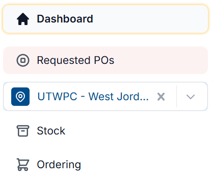
To return to the Dashboard, select Dashboard the from left-hand menu
-
A screen similar to the one below will display
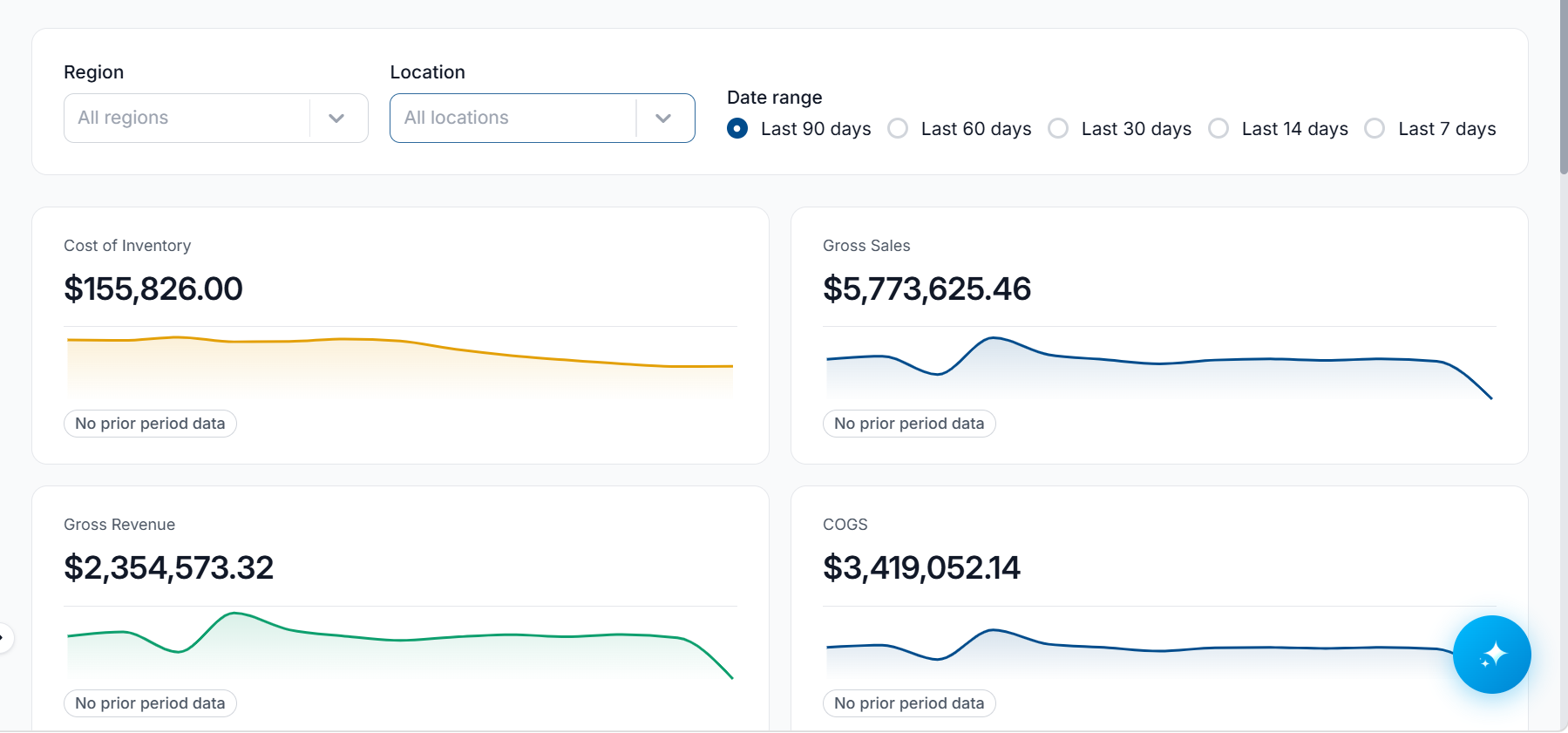
If you are assigned to multiple locations, the dashboard will show the combined data for all of those locations.
If you are assigned to a region, you will see the data for all of the locations assigned to the location.
Filtering the Dashboard
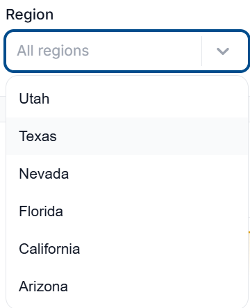
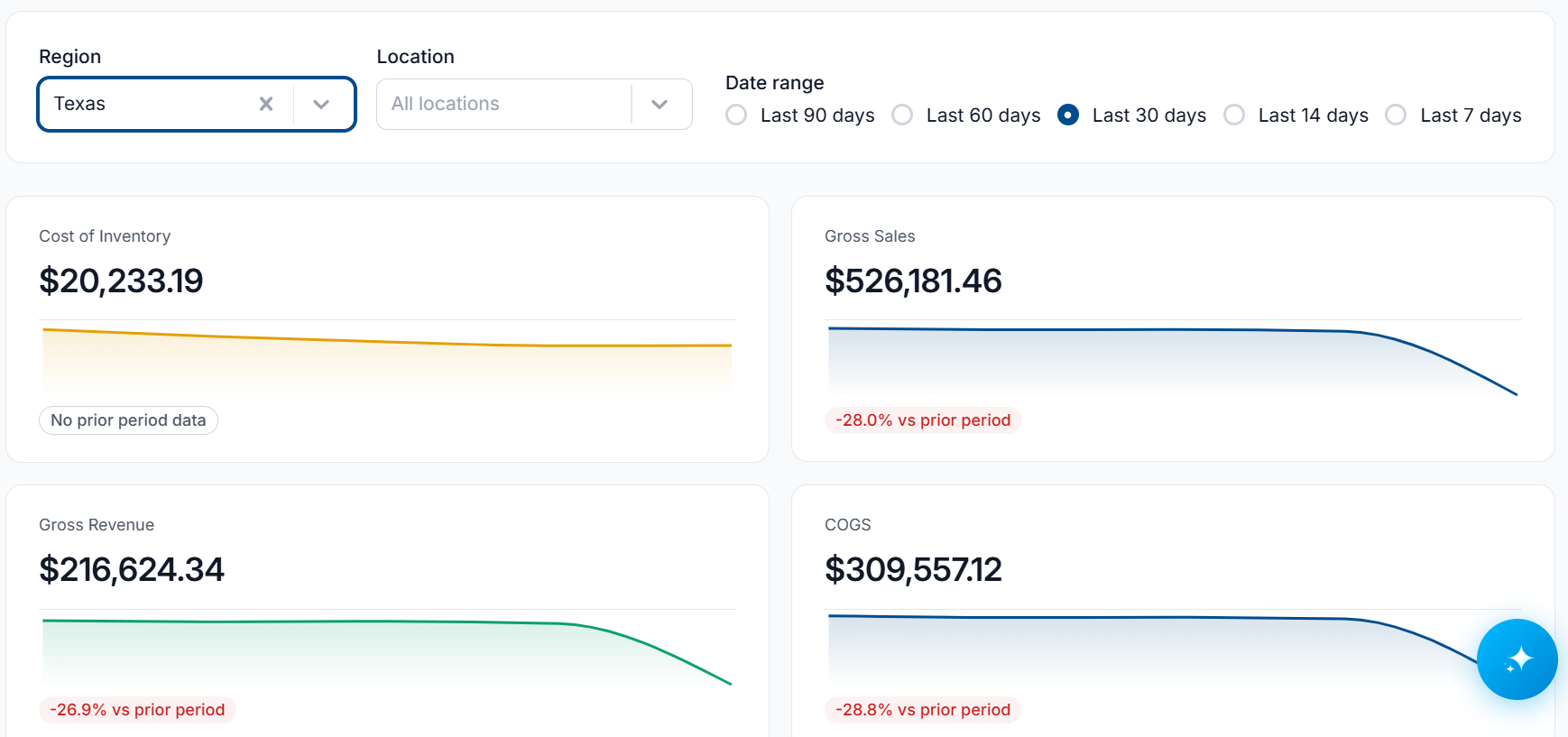
Filtering by Region
If you are assigned to multiple regions, a filter can be applied to view the data on a specific region. To filter apply a region filter:
-
Select the Region dropdown, and select the region you want to view data on
-
The dashboard will adjust to show data on the selected region
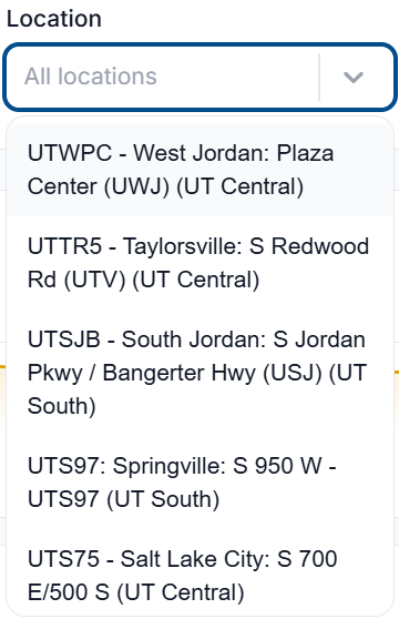
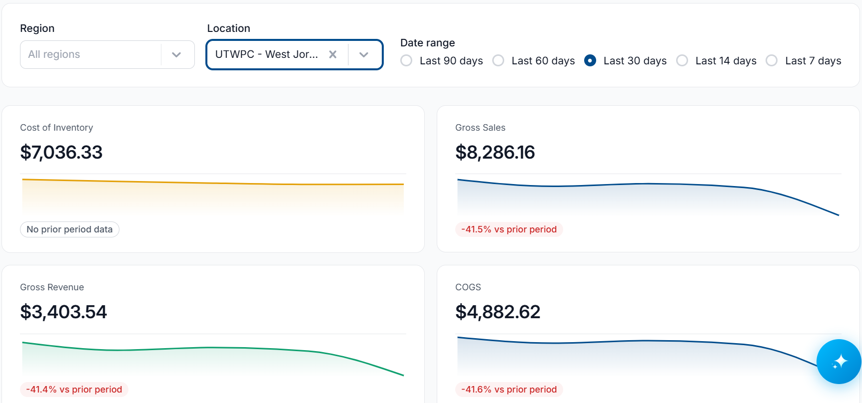
Filtering by Location
If you are assigned to multiple locations, a filter can be applied to view the data on a specific location. To apply a location filter:
-
Select the Location dropdown, and select the location you want to view data on
-
The dashboard will adjust to show data on the selected location
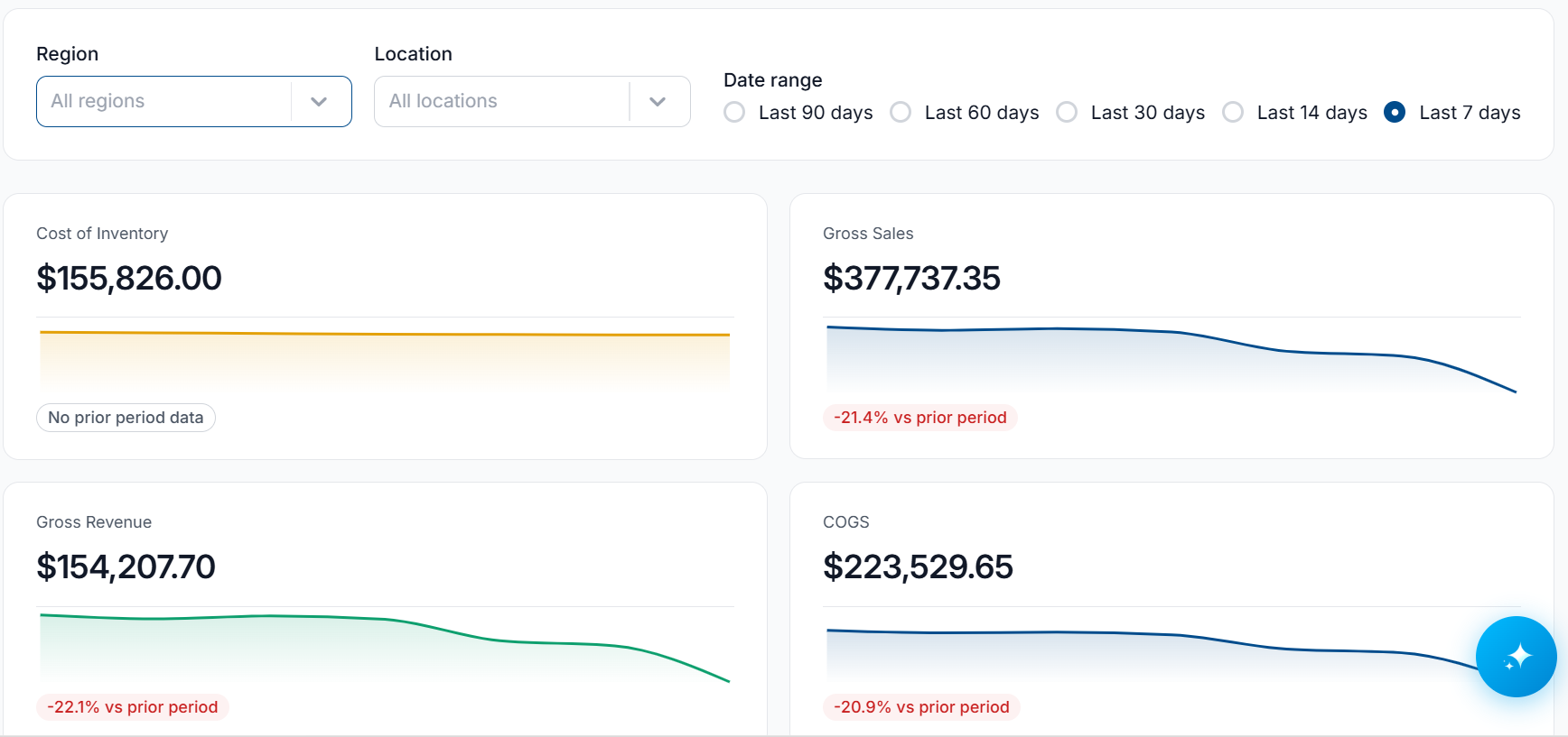
Filter by Date Range
A filter can be applied to adjust the data displayed on the dashboard to a set date range. To apply a date range filter:
-
Select one of the Date Ranges from the available options

-
Last 90 Days - Dashboard will display data based on the last 90 days.
-
Last 60 Days - Dashboard will display data based on the last 60 days.
-
Last 30 Days - Dashboard will display data based on the last 30 days.
-
Last 14 Days - Dashboard will display data based on the last 14 days.
-
Last 7 Days - Dashboard will display data based on the last 7 days.
-
-
The dashboard will adjust to show data from the selected date range
Dashboard Cards
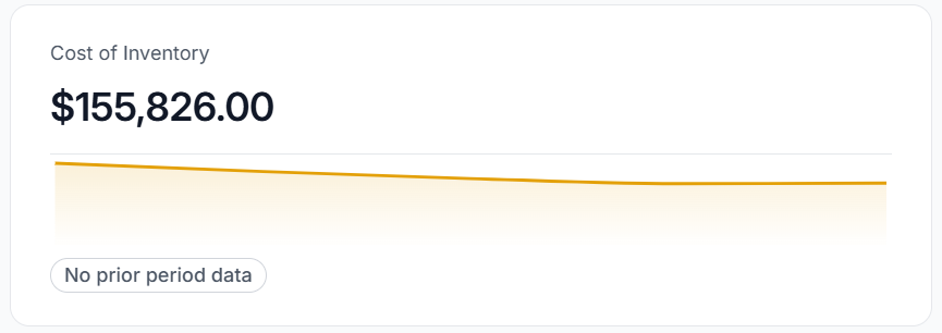
Cost of Inventory
The total value of all items in stock, calculated using item costs and available quantities. This metric provides a real-time view of your inventory investment, helping you track asset value, and make informed purchasing and financial planning decisions
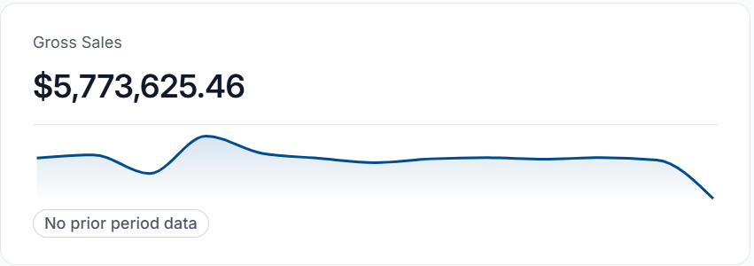
Gross Sales
Track the total revenue generated from all sales. Use this metric to monitor overall sales performance and identify revenue trends across your inventory.
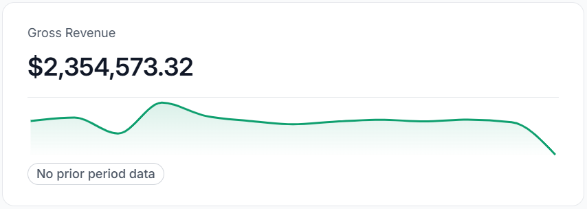
Gross Revenue
Track the total revenue generated from all sales. This metric provides a high-level view of your business's sales performance and helps monitor overall revenue trends.
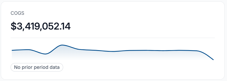
COGS (Cost of Goods Sold)
The total direct cost of inventory sold within the selected timeframe. Use this metric to measure sales profitability, monitor cost trends, and make informed purchasing decisions.
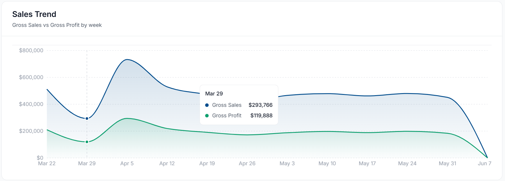
Sales Trend
Track sales performance over time with real-time trend analysis. Monitor revenue patterns, identify peak selling periods, and compare sales activity across selected date ranges to make informed inventory and purchasing decisions.
Item Sales Breakdown
Analyze sales performance across different locations and product categories. Compare revenue and sales volume by location, or region, identify high-performing categories, and uncover trends to support inventory planning and business growth.
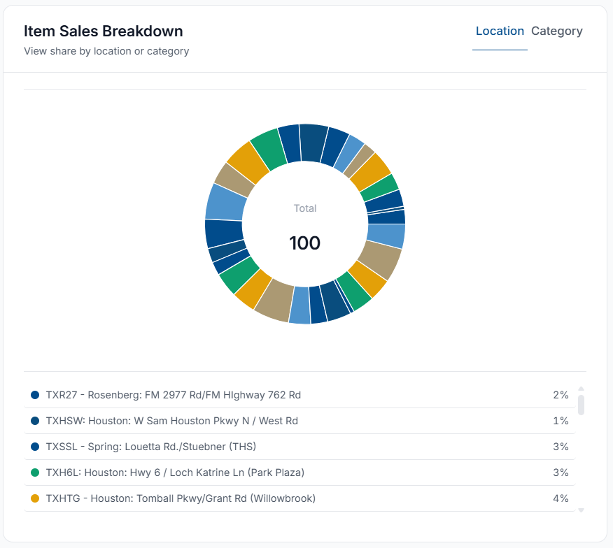
By default, the Item Sales Breakdown shows data based on Location. To view data based on product categories, select Category on the top-right of the card.
Shrinkage Report
The Shrinkage Report card provides a detailed view of inventory performance across locations, categories, and individual items. Compare each Location’s, Category’s, or Item's contribution to total sales, monitor shrinkage rates, and track performance trends over time to identify top-performing products, inventory loss risks, and opportunities for optimization. The Trend indicator highlights changes in sales and shrinkage patterns, helping teams make informed stocking and operational decisions.
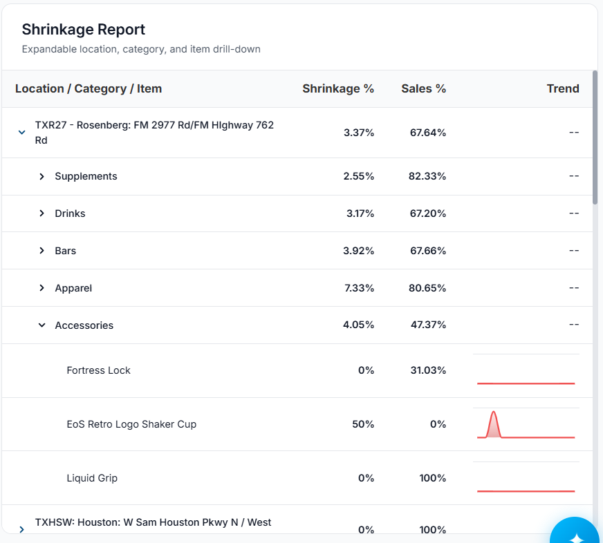
By default, the Shrinkage Report card shows data based on Location, selecting the > next to a location will break that data down to each Category.
Selecting the > next to a category will break down its data to each Item in the category.
See below for a breakdown of what each column represents:
|
Column |
Description |
|---|---|
|
Location / Category / Item |
The individual Location, Category or Item that the data is representing |
|
Shrinkage % |
Percentage of stock lost due to shrinkage over the selected date range |
|
Sales % |
Percentage of stock sold over the selected date range |
|
Trend |
Graph depicting shrinkage trends over the selected date range |
Low Stock
The Low Stock card highlights inventory items that are at risk of running out based on current stock levels and recent sales trends. It helps teams quickly identify and prioritize replenishment needs across locations.
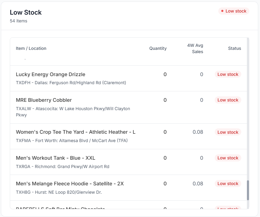
See below for a breakdown of what each column represents:
|
Column |
Description |
|---|---|
|
Item / Location |
The item that is low stock, and the corresponding location |
|
Quantity |
Current quantity of the item that is low stock at the corresponding location |
|
4W Avg Sales |
A 4-week average of sales on the item that is low stock at the corresponding location |
|
Status |
Current status of the low stock item. |
High Stock
The High Stock card highlights inventory items that are currently above typical demand levels, helping you identify overstocked products and optimize purchasing decisions.
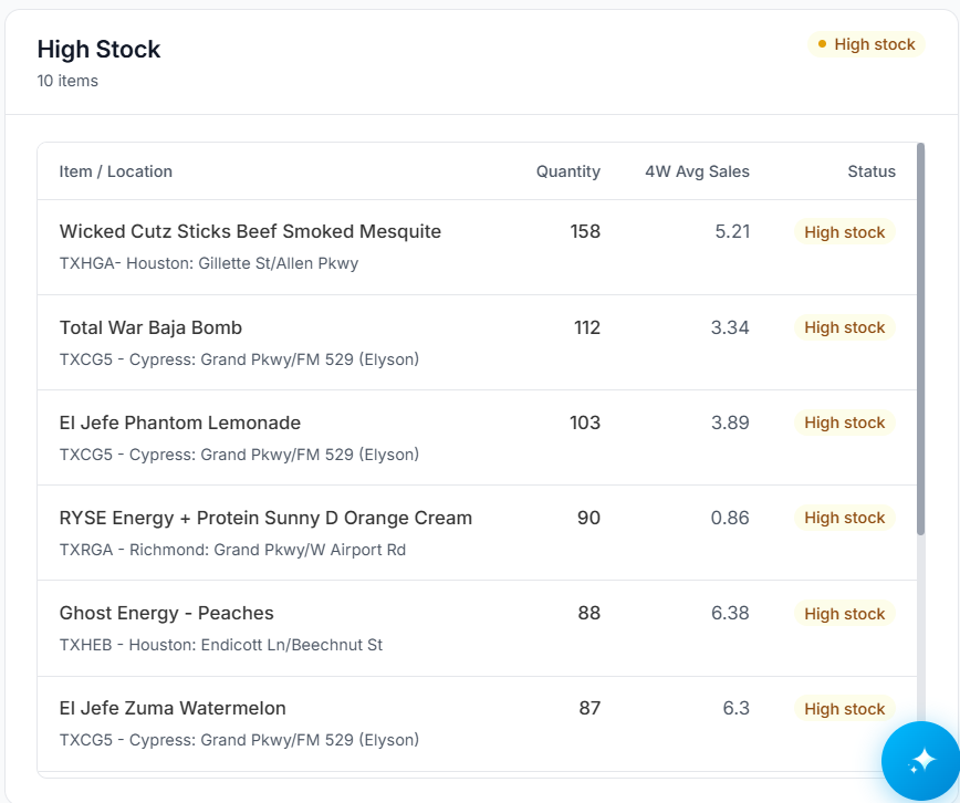
See below for a breakdown of what each column represents:
|
Column |
Description |
|---|---|
|
Item / Location |
The item that is high stock, and the corresponding location |
|
Quantity |
Current quantity of the item that is high stock at the corresponding location |
|
4W Avg Sales |
A 4-week average of sales on the item that is high stock at the corresponding location |
|
Status |
Current status of the high stock item. |